it’s Classic but it’s Good
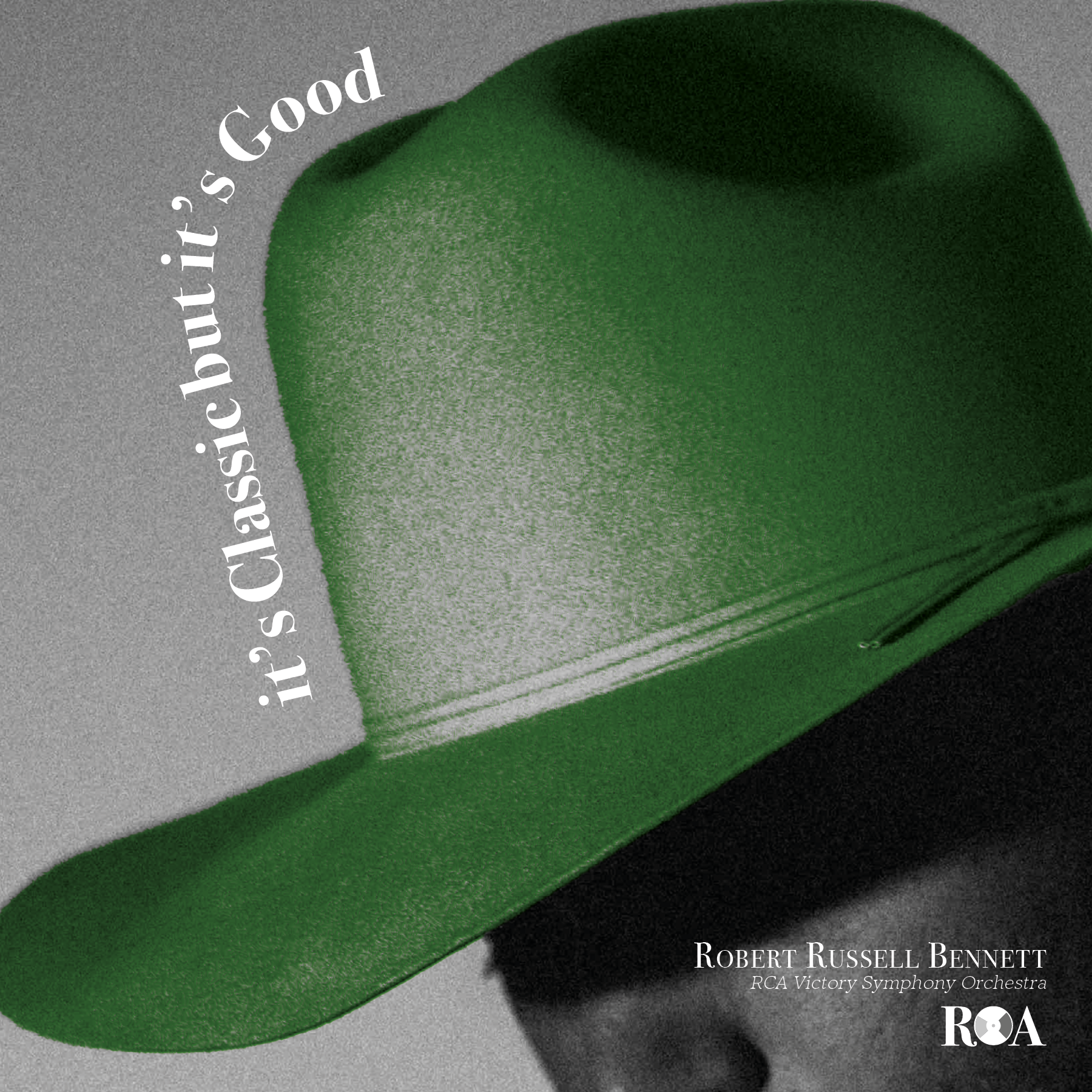
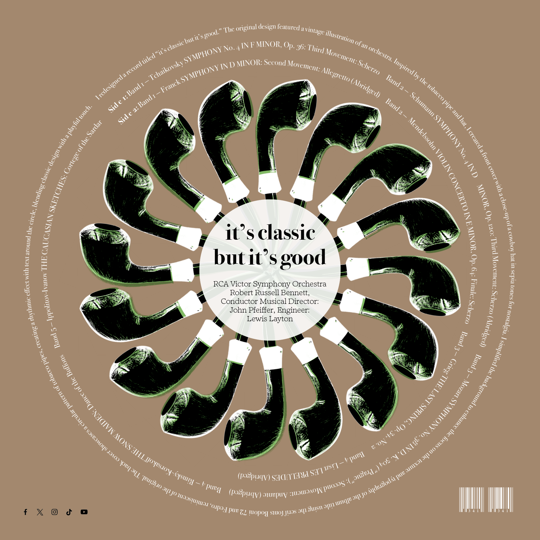
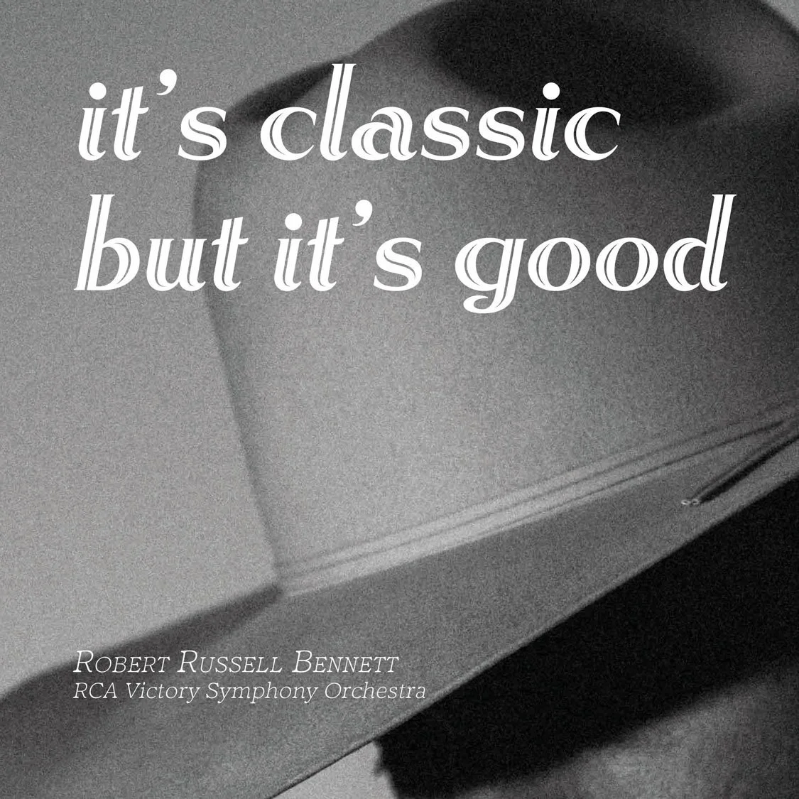
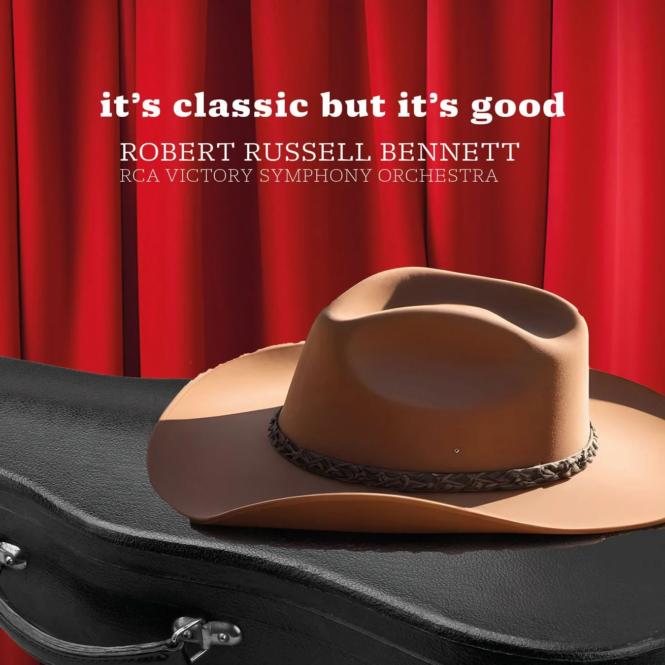
For this project, I redesigned a record titled “it’s classic but it’s good.” The original design featured a vintage illustration of an orchestra. Inspired by the tobacco pipe and hat, I created a front cover featuring a close-up of a cowboy hat in sepia tones for a nostalgic effect. I simplified the background to enhance the focus on the texture and typography of the album title using the serif fonts Bodoni 72 and Fedro, reminiscent of the original. The back cover features a circular pattern of tobacco pipes, creating a rhythmic effect and blending classic design with a playful touch.
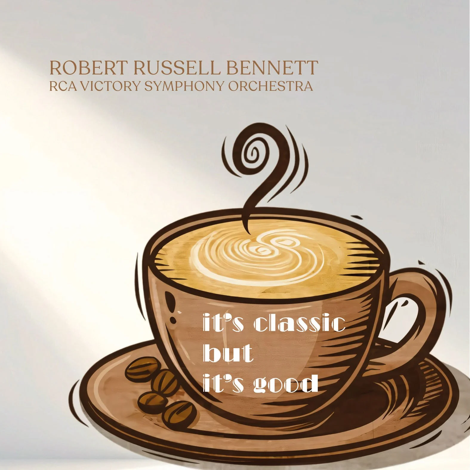
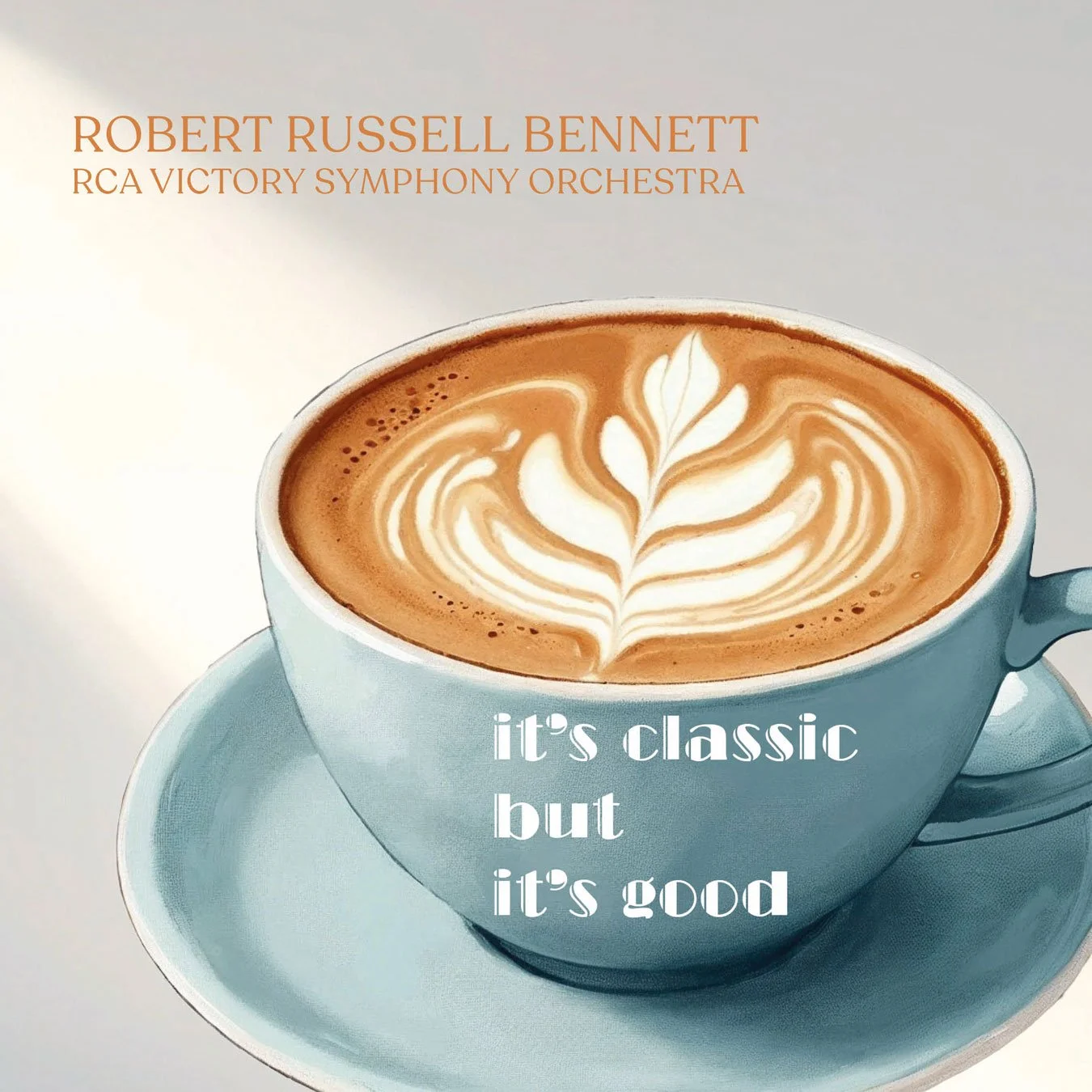
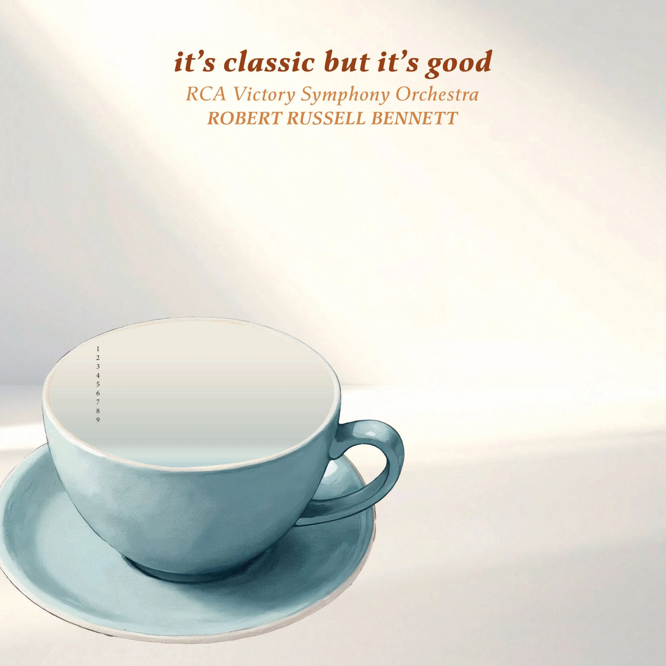


LOGO EXPLORATIONS