MUN matcha & tea
For Mun Matcha and Tea, I aimed to develop a brand system aligned with your vision of creating a comfortable, welcoming space where people can connect and build community. In translating that vision into a visual identity, I focused on maintaining a clean, minimal look while expressing a culturally blended tone that supports the local community.

LOGO:
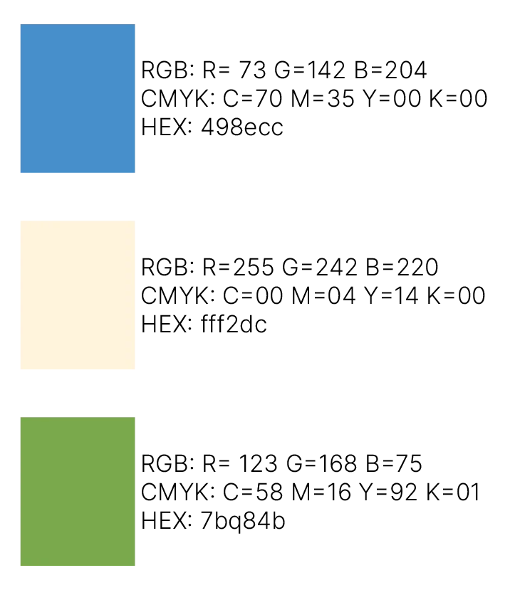
COLORS:
TYPEFACES:
Yuji Syuku Regular
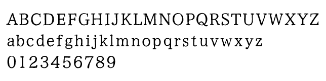
Polymath Regular

PATTERN:
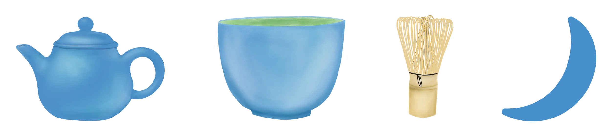
ICONS:
CUPS & MENU
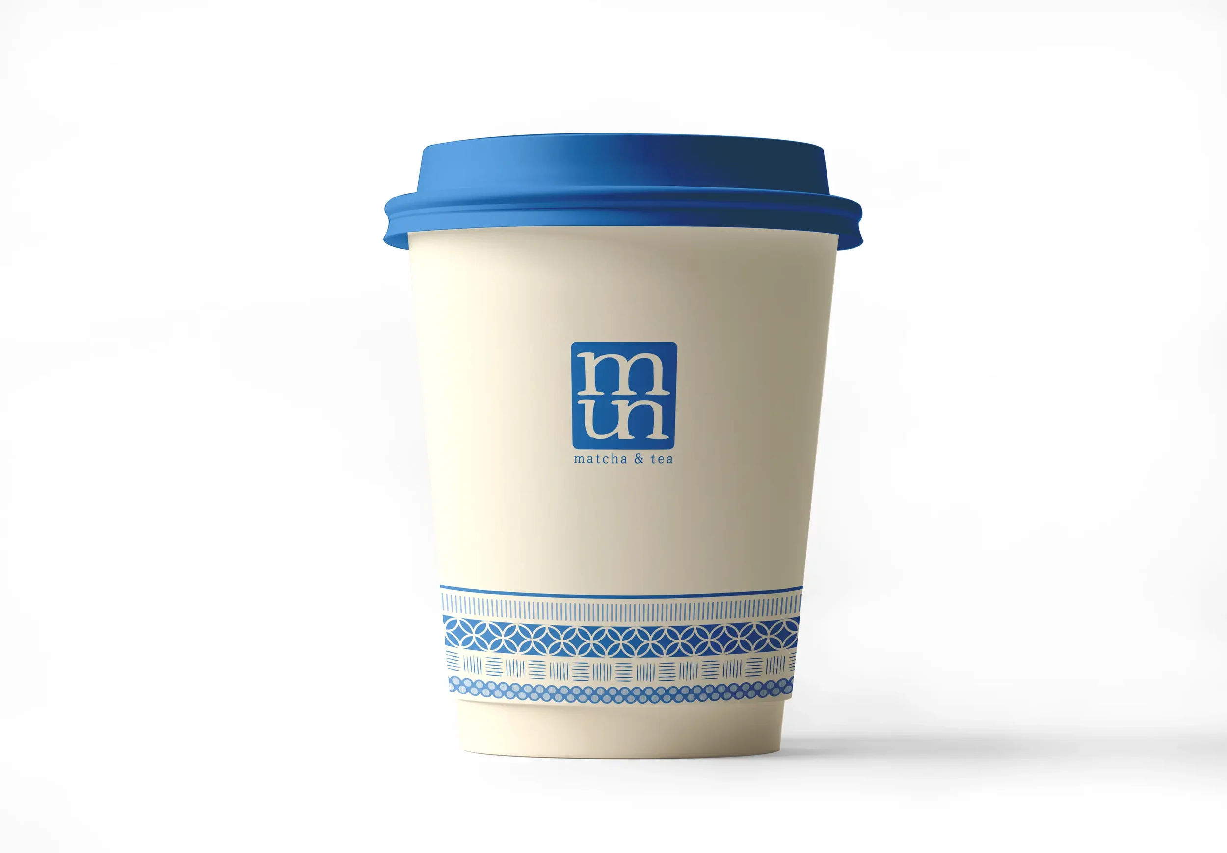
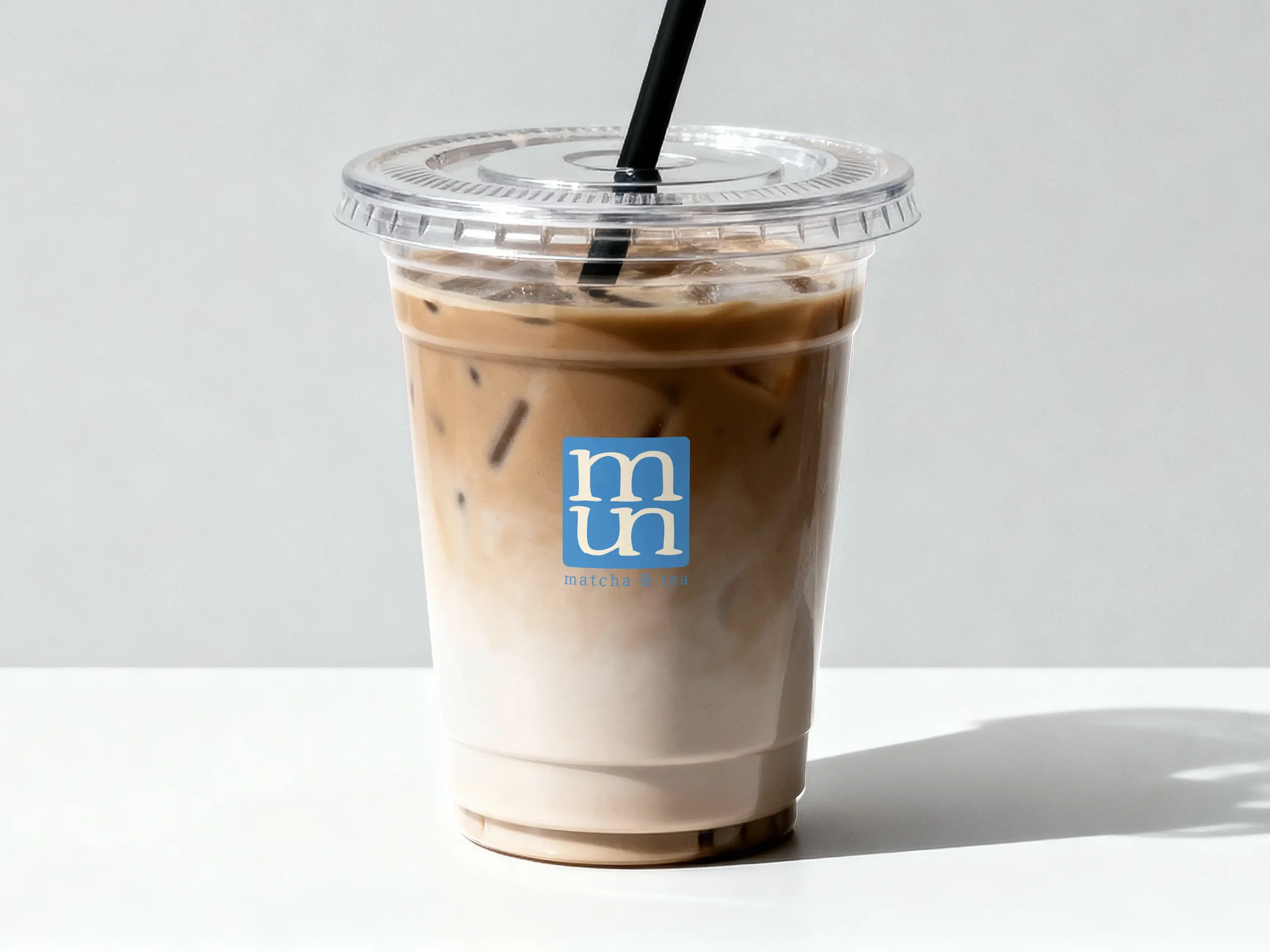
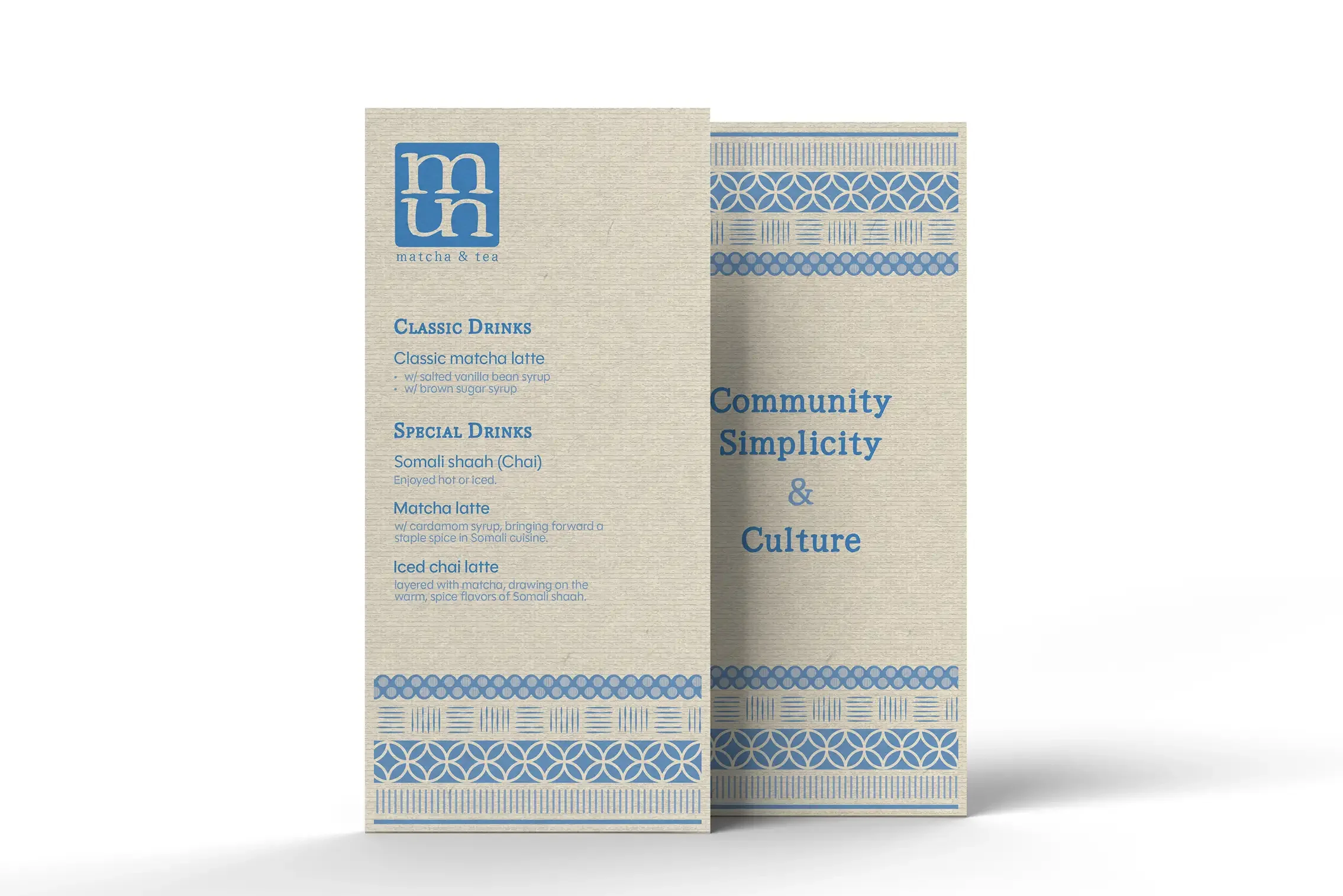
The menu and hot cup share a blue pattern that blends motifs inspired by Somali textiles with traditional Japanese patterns. The pattern’s flow also references the coastline as a common connection between Somalia, Japan, and San Diego. For the iced cup, I kept the design minimal so the drink stays visible and becomes the main visual.
Social Media & Responsive Screens
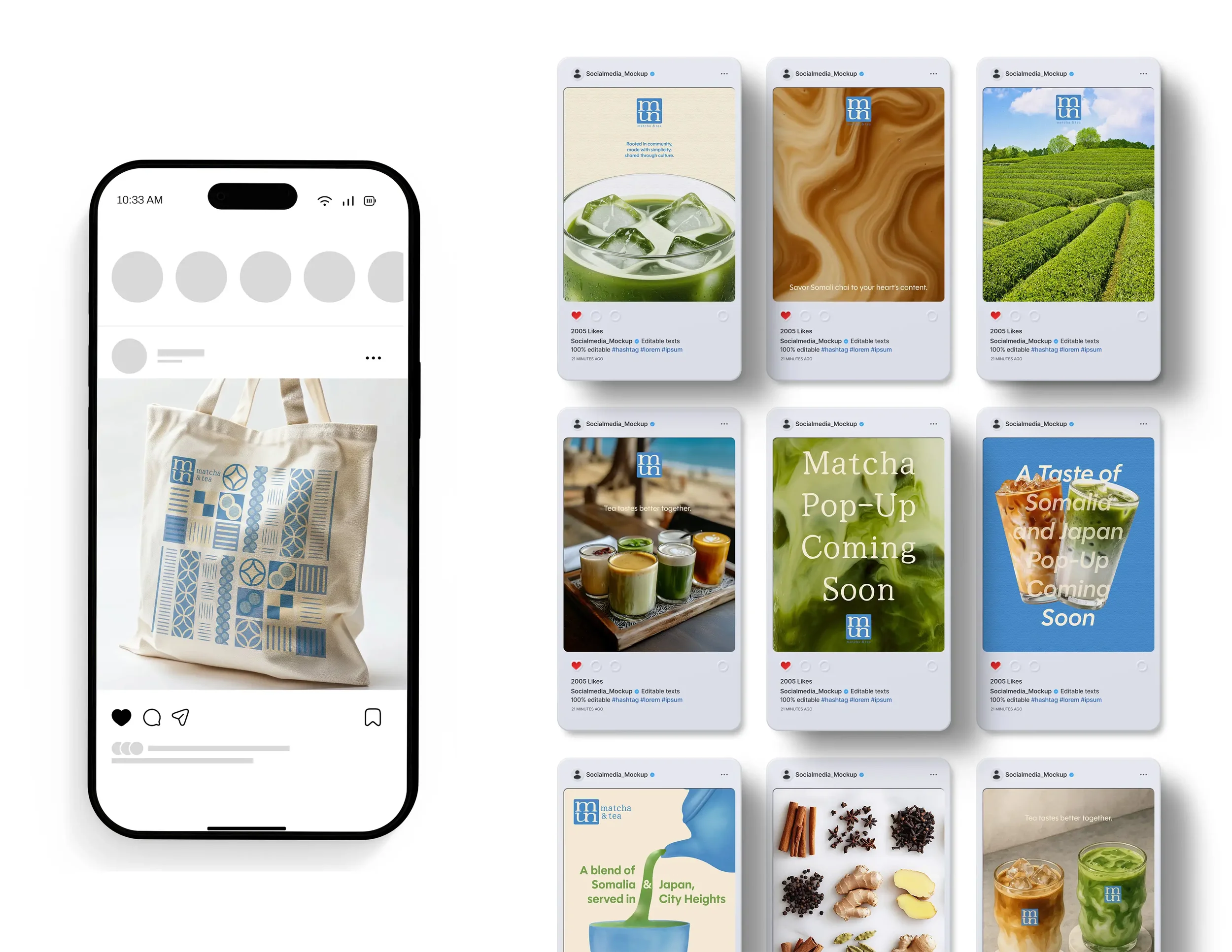
I designed a tote bag with small patterned tiles that come together to form one unified design. It represents how a community is built from many individuals. I also explored a set of social media post templates that combine photos and simple graphics. The direction is built around simple, approachable communication, so people can easily recognize the brand and key information at a glance while scrolling.
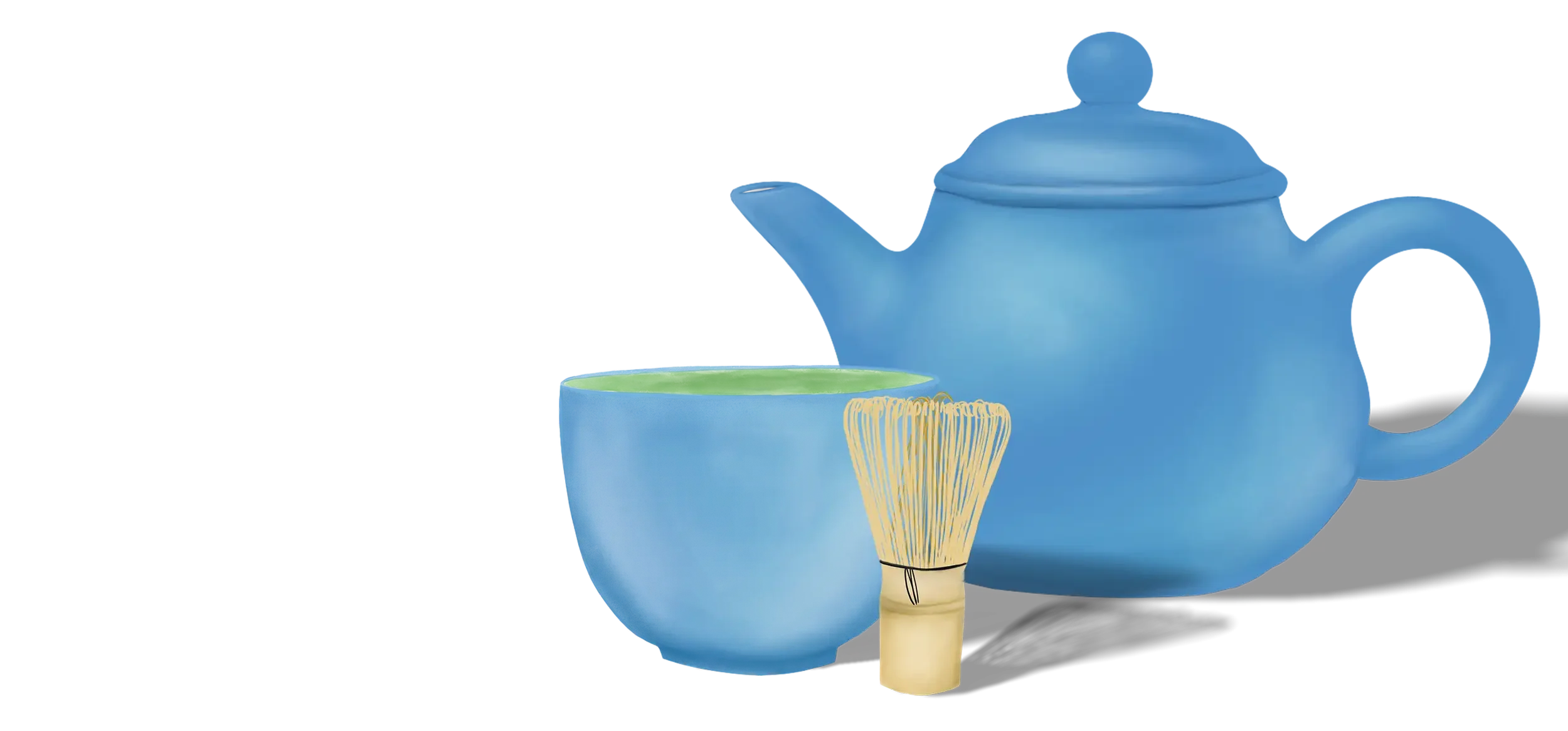
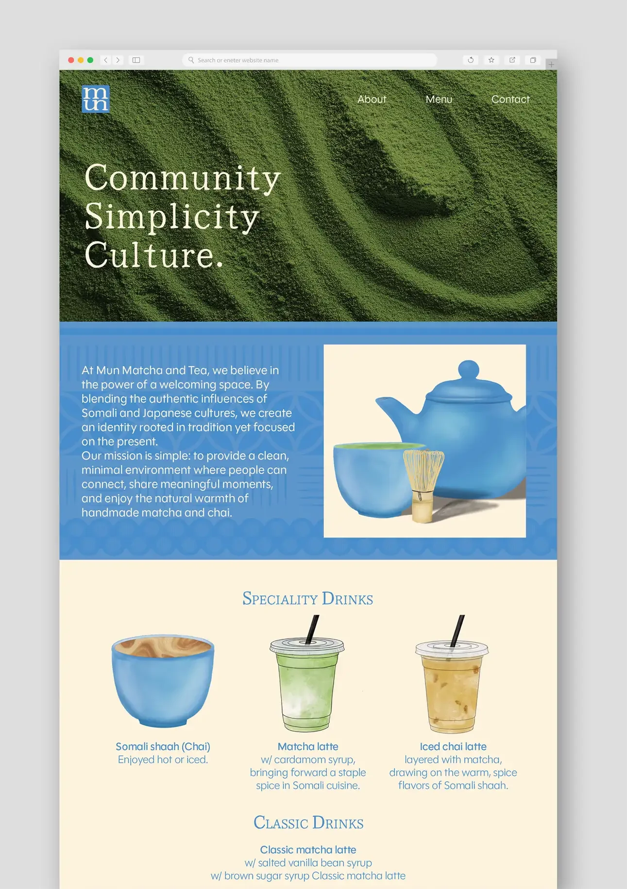
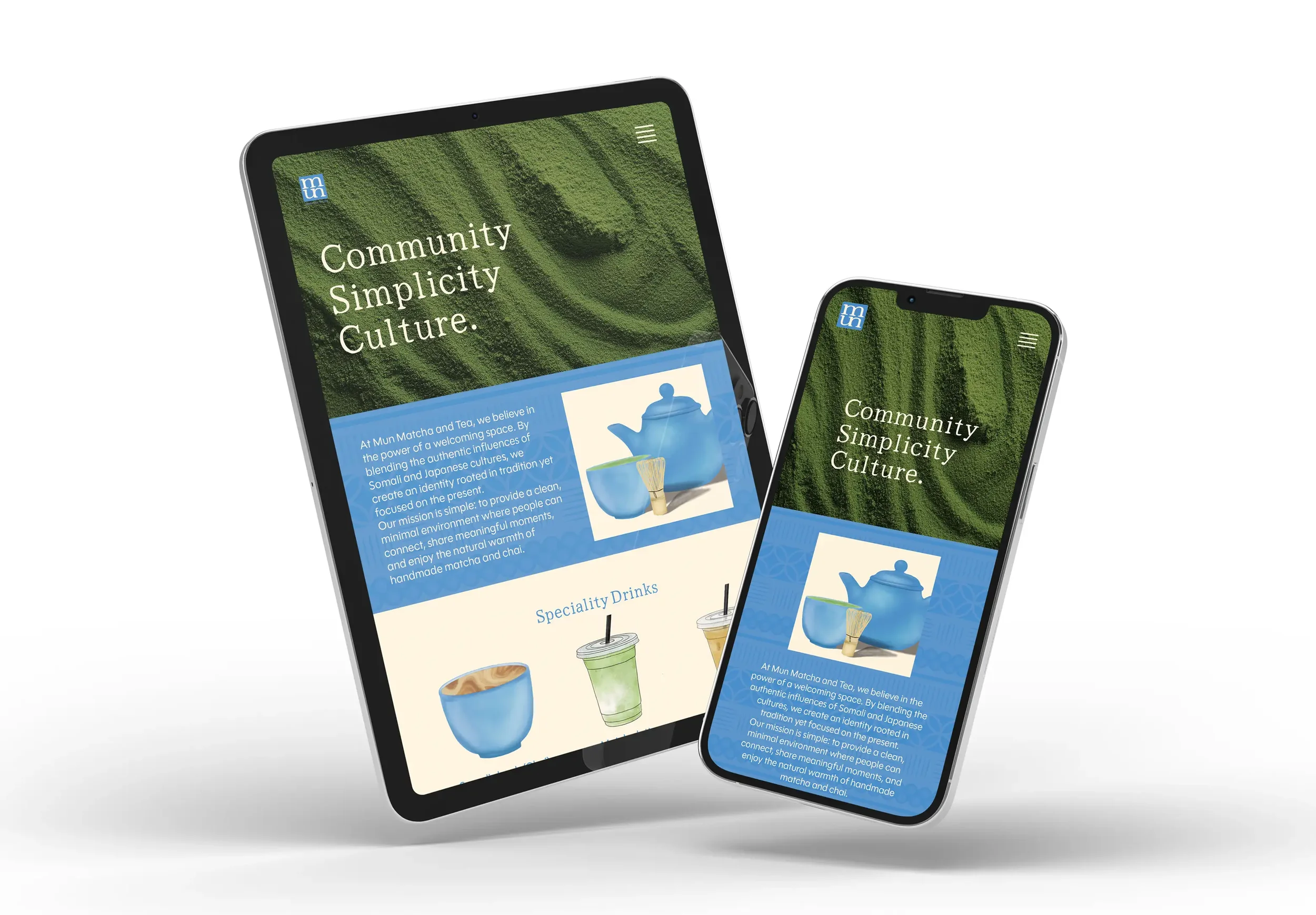
For the website, I kept the layout calm and clean, using simple illustrations to add warmth while highlighting matcha as the signature.
Pop-Up Setup
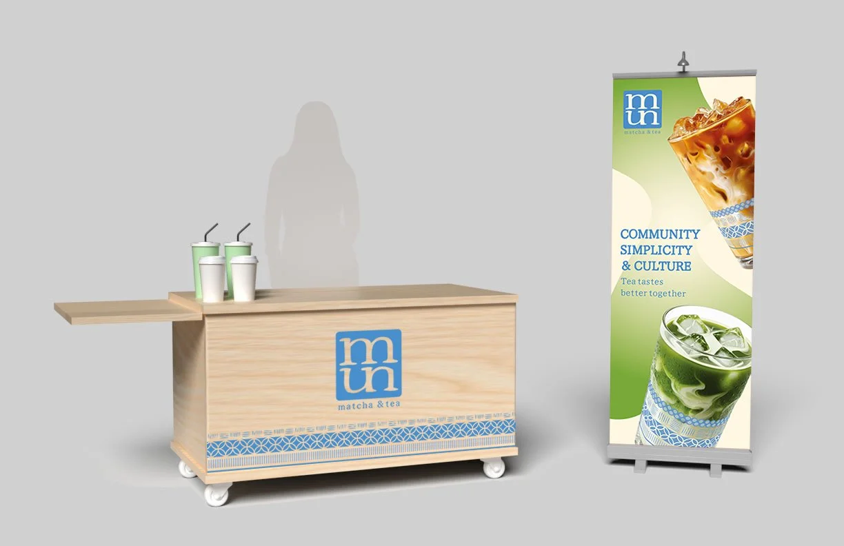
I designed the banner with green tones and large images of drinks so people can quickly understand what MUN offers from a distance. The cart uses the same graphics as the hot cup to keep everything aligned.